Domo offers a vast landscape of features that can help turn your data project from ideation to a product that drives invaluable business impact. With many features comes many complexities to building and scaling your Domo project.
In this article, we’ll walk through the steps involved in creating a complete project in Domo. Whether you’re a Domo beginner or an experienced pro, you’re sure to find something helpful in this guide.
While there are several different ways to build a project in Domo according to one’s specific use case, business, processes, etc., the purpose of this is to provide a general overview of how to build a project in Domo. I’d suggest taking the information below and tailoring it to fit your unique business needs.
1. Discovery
Before beginning any data analysis project, it’s important to clearly define the problem or research question you are trying to address. This helps to focus your efforts and ensure that the data you collect and analyze is relevant to your specific needs.
The discovery phase will set your project up for the remaining 9 steps, so you will want to consider those steps when doing your discovery. For example, where is the data coming from? Will the data answer the questions we are looking to solve? Who needs access to this data? Etc.
Proper discovery is a foundational piece to your project, and by taking the time to define the problem clearly, you will be well-positioned to move on to the next step in the data analysis process: planning your project.
2. Plan Project
Domo’s project management feature allows you to create and manage projects, assign tasks to team members, track progress, and collaborate with your team in real time. This functionality within the same tool you use for most of your data tasks helps streamline your workflow and keep everything in one place.
To start planning out your project:
- Select the “More” option in the header bar and choose “Projects and Tasks”.
- Click “Add Project” to create a new project.
- Fill out the project settings, including the name, owner, team members, privacy settings, description, and due date.
- Start adding tasks to the “To Do” list based on your discovery.
Consider adopting an agile approach to manage your data project. An agile approach is a project management methodology that emphasizes flexibility and rapid iteration. It involves breaking down a project into smaller pieces or “sprints” and continuously adapting and refining the project based on feedback from stakeholders.
This approach can be particularly useful for data projects because it lets you focus on delivering value to your stakeholders quickly and continuously. By breaking the project down into smaller chunks, you can more easily prioritize work and features based on their relative importance and focus on delivering the most valuable items first.

Pro Tip: To improve organization, usability, and reusability in your Domo instance, consider implementing naming conventions for all elements, including cards, datasets, dataflows, certification processes, PDP policies, and more. Check out these naming best practices.
3. Connect data source
Domo offers over a thousand pre-built connectors that allow you to easily import company data into the platform, whether it is hosted in the cloud or on-premises. These connectors make it easy to get the reports you need without maintaining custom integrations.
If you need to bring in data from a source that does not have a pre-built connector, you can use Domo’s APIs to create a custom integration. Overall, pre-built connectors are a convenient and reliable option for importing data into Domo, and are great if you are just starting out.
To connect to a data source:
- In the top right header, click the “Plus” icon.
- Select the option titled “Data” and then choose “Connectors”.
- Search and select the desired data source.
- Authenticate the data source and set the report type, refresh frequency, and others as needed.
When setting your refresh schedule, consider how often you need this data. If the data only needs to be viewed once a day, set the cadence to pull data right before you need it so that the API isn’t getting overloaded with calls.
4. Transform data with Magic ETL
Domo offers a number of different ways to transform your data. However, the Magic ETL tool is one of the most flexible and easy-to-use methods.
Magic ETL enables users by providing drag-n-drop SQL-like transformations. You can perform many functions, including but not limited to the following:
- Join functions
- Window functions
- Date functions
- Pivots
- And more
Here’s an example of a use case where you would need to use Magic ETL:
Imagine that you are working for a retail company and want to analyze sales data to identify trends and improve your marketing efforts. You have access to various data sources, including sales transaction data from your point-of-sale systems, customer data from your CRM system, and product data from your inventory management system.
Magic ETL can help you combine all of this data into a single dataset and prepare your data for analysis and visualization in Domo, allowing you to gain insights and make informed decisions based on your sales data.
To start using Magic ETL:
- Click on the “Data” tab in the header.
- In the sub-menu in the “Magic Transform” section, click “ETL”.
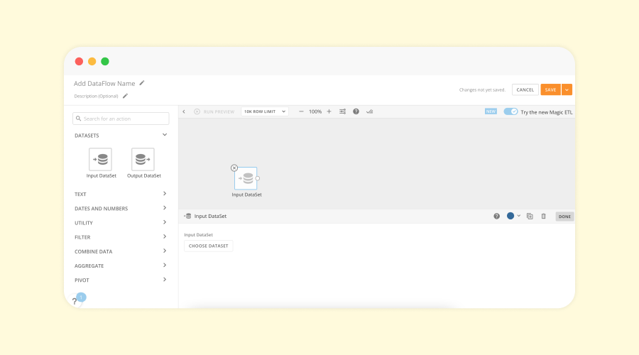
- You will be transferred to the Magic ETL interface, where you can drag the tile titled “Input DataSet” into the blank canvas.
- From here, you can add your dataset and start making transformations.
Magic ETL tiles in Domo allow you to customize the title and description of your data transformation flows to provide more context and detail about what is happening in the flow. This can be particularly useful when working with a team, as it helps to ensure that everyone is on the same page and understands the purpose and intent of the flow.
5. Build cards
A card in Domo is a visual representation of data displayed on a dashboard and is used to answer the business question defined in the first step of the process. You can use cards to display various consumption types, such as charts, graphs, tables, maps, or text.
To create a card:
- Click the “Plus” icon in the header.
- Select “Card” and choose between the different card options. In most instances, you will use the visualization option, which you will use to create charts and graphs.
- Next, you will select a dataset from which you’d like to pull data to populate the card.
- Finally, you are in the Card Analyzer, where you can choose from various settings to configure and answer your business problem.
Try the following tips to get the most out of your cards:
- Include summary numbers or other context-providing details in your cards to give users a deeper understanding of the data they’re viewing.
- Add hover options that allow for interactivity and information for users who want to dive in and extract more detailed information.
- Add a drill path to allow users to drill into the cards and glean more in-depth insights.

Pro Tip: Domo has a ton of pre-built apps that have pre-built dashboards, helping you bypass a lot of the heavy lifting involved with building a project in Domo. Go to the app store and search to find an app that will suit your needs.
6. Build dashboard
It’s time to bring your dashboard to life! This is the moment you’ve been working towards, where all of your pre-processing, data cleaning, project planning, and card creation come together in a cohesive, visually appealing display of insights.
Creating a well-designed dashboard is crucial for the success of your project. This is because the dashboard is the primary tool stakeholders will use to make data-driven decisions. If the dashboard is clear and easy to interpret, stakeholders may make good decisions that can negatively affect the company. Therefore, it’s essential to put in the effort to ensure that your dashboard is straightforward, intuitive, and effective in communicating key insights.
Here are the steps to start creating your dashboard:
- Click the “Plus” icon in the header and click “Dashboard”.
- Name your dashboard.
- Drag your cards onto the dashboard canvas and start strategically organizing them.
Effective dashboard design requires careful planning and attention to detail. To create a dashboard that is useful and engaging for stakeholders, consider the following tips:
- Prioritize the most critical metrics by placing them in the top left corner of the dashboard, where users’ eyes naturally gravitate first.
- Use clean, uncluttered design to help users focus on crucial information and extract insights easily.
- Only choose the most important information. If there’s too much content on the page, it may be hard for the user to digest the information being presented, and will take away from the most important action-driving metrics.
7. Configure PDP
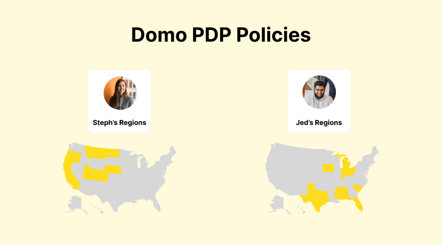
Personalized Data Permissions (PDP) allows you to provision filters at the dataset level. The data team can use this functionality to allow business users access to a view of data specific to the business user. PDP saves you the headache of having to fuss with multiple filter-specific dashboards.
For example, suppose you have sales teams in various cities across the United States and want them only to see sales metrics specific to their region. In that case, you can configure PDP permission to only allow them to see the data for their area.
How to configure PDP settings in Domo:
- To configure PDP settings in your Domo instance, navigate to the dataset of your choice and select the PDP option.
- Select “Add Policy”, name the policy, and choose the data that should be accessible in the policy.
- Finally, you can choose to add individuals or groups to the policy.
In Domo, users can take on different roles depending on their tasks, such as viewing data or creating dashboards. By understanding the needs of each user, you can assign them to groups based on their needs, department, and other factors. This helps to streamline data access and management and will help support governance initiatives.
8. Test data
Imagine building the most beautiful, intricate dashboard, only to realize that you’ve been tracking the wrong metrics the entire time. Your dashboard would be completely ineffective – wasted time, effort, resources, and, most importantly, company money.
Domo allows you to establish a certification process for both cards and datasets, which is a way to verify the accuracy and reliability of the data. When a card or dataset has gone through the certification process, it will be marked with a blue badge to indicate that it has been thoroughly tested and can be trusted by users. This feature ensures that stakeholders make decisions based on high-quality, reliable data.
To create a certification process:
- Go to the Admin panel, navigate to the Features section at the bottom, and click “Certified Content”. You can choose between a company or department certification, add a description of the steps for testing, and designate people to approve.
- After you’ve set up your certification process, request that your dataset and card be certified.
- To test your data, you will follow the steps you outlined in the description. These steps may include verifying the data against the source data, adding a description or summary number to the card, assigning an owner, and other relevant tasks.
- Finally, the certification process can be approved after the data has been thoroughly tested.
9. Document
Documentation helps to ensure that others can understand and use the dashboard effectively by providing a clear and concise record of its purpose, layout, and design. For example, suppose a stakeholder or data team member needs clarification about how a particular metric is calculated or which filters were applied. In that case, documentation can help to clear up any confusion.
Domo’s notebook cards allow you to document your dashboard, metrics, and other items directly within the platform. Like Google Docs or Microsoft Word, notebook cards provide an easy way to create documentation without needing external tools like data dictionaries or catalogs.
You can access a notebook card by:
- Clicking the “Plus” icon in the header.
- Selecting “Card” and choosing “Notebook”.
After you have documented your dashboard, it is best practice to link directly to the notebook card at the bottom of the dashboard so that users can easily find and access answers to any questions they may have.

Pro Tip: You can get creative with notebook cards in Domo. Using notebook cards and dashboards, you can create a data dictionary right within your Domo instance!
11. Set alerts
In Domo, alerts are triggered when certain conditions are met within your data or business. For example, you could set up an alert to notify you if your company’s sales drop below a certain threshold or if a key metric exceeds a particular target.
You can configure alerts to send notifications via email, SMS, or in the web or mobile application, and can be customized to trigger based on a wide range of conditions and parameters.
To create an alert:
- Navigate to the card that you would like to get notified about.
- Click the “Wrench” icon and select “Alert Me”.
- Click “New Alert”.
- Follow the steps to create your alert.
To ensure that your team can effectively respond to essential notifications, it’s important only to set alerts for the most critical events. If too many alerts are constantly firing, it can be difficult for users to distinguish between high-priority and low-priority notifications. You can help your team focus on the most critical tasks and minimize distractions by carefully selecting the events that warrant an alert.
Conclusion
Every business has their own processes and strategies for conducting data projects. You should gear the provided steps in a manner that makes the most sense for your organization.
